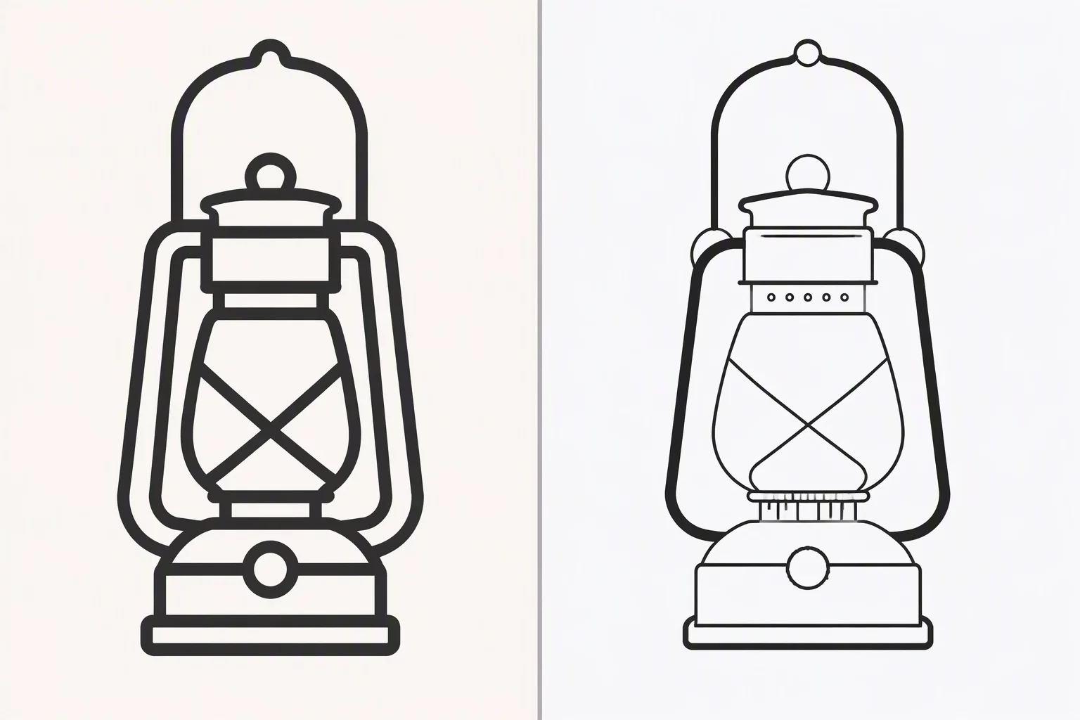
The Foundation of Contrast in Vector Contours
When vector shapes share identical line weights, the eye struggles to distinguish the primary contour from secondary structural lines. The thick-versus-thin rule resolves this ambiguity by establishing an immediate visual boundary. By setting the outer perimeter stroke significantly heavier than internal hatchings or accents, the subject detaches cleanly from its surroundings. This principle anchors the composition, creating an unmistakable reading order.
Inside vector layout environments like CorelDRAW, artists frequently fall into the trap of applying a uniform 1.5 pt or 2 pt outline to every path in a glyph. The result feels cluttered, heavy, and visually flat. Shifting internal seams down to 0.5 pt while reinforcing primary silhouettes to 2.5 pt transforms muddy line-work into a structured graphic that retains legibility across any zoom level.