Featured Cases • September 28, 2026 • 6 min read

The Inner Contour Needed a Different Role

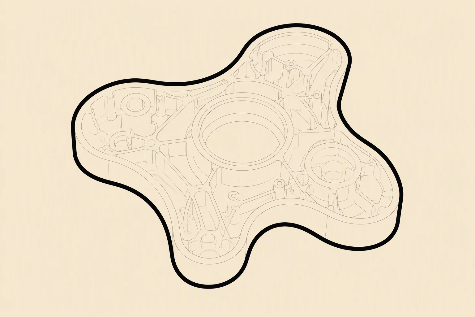
Treating internal vector divisions with the same stroke weight as the enclosing silhouette flattens depth and disrupts comprehension. Here is how delineating stroke roles restores optical balance.

Stroke Hierarchy Internal Line Weight 3:1 Boundary Ratio
Vector diagram highlighting the functional difference between inner structural lines and perimeter boundaries

The Optical Collapse of Uniform Contours

Illustrators frequently default to applying one consistent outline property across an entire vector object. While uniformity appears logical in technical stroke panels, it ignores human visual perception. When perimeter boundaries and interior surface seams carry identical stroke width, the mind interprets every segment as a separate detached fragment rather than a single unified entity with interior structural details.

A silhouette isolates an object from surrounding whitespace, creating the initial silhouette impression. In contrast, interior lines describe surface articulation, secondary folds, and internal material transitions. Forcing interior divisions to bear the same optical intensity as the enclosing border turns clean symbols into dense geometric mazes that break down completely when scaled.

Vector Methodology

Systematize Your Vector Outlines

Interested in evaluating boundary contrast ratios across your vector illustration library? Connect with our research team to discuss visual hierarchy principles.

Inquire With Desk

Calibrating Subordinate Roles for Interior Strokes

Resolving this conflict requires treating the interior contour as an informative accent rather than a primary boundary. Establishing an intentional weight disparity between outer paths and inner seams allows the exterior silhouette to anchor the shape immediately, leaving interior strokes to register secondarily.

Rule of Thumb: Maintain at least a 2.5:1 or 3:1 stroke weight ratio between outer perimeter paths and inner structural lines to guarantee visual clarity at both macro and micro viewports.

Beyond stroke thickness, subtle shifts in tone or opacity can further refine hierarchy. Reducing interior line saturation or matching inner contours closely to fill values softens visual noise, allowing intricate artwork to retain spatial depth across dense technical diagrams and responsive user interface iconography.

Core Principles

Key Structural Insights

  • Silhouette Dominance: Exterior outlines must remain distinctly boldest to preserve the immediate physical footprint of the graphic.
  • Functional Subordination: Internal lines serve descriptive rather than containment roles, requiring reduced line weights to avoid fragmenting the object.
  • Scale Resilience: Subordinating interior strokes prevents lines from colliding or bleeding together when the asset shrinks down to icon dimensions.

Frequently Asked Questions