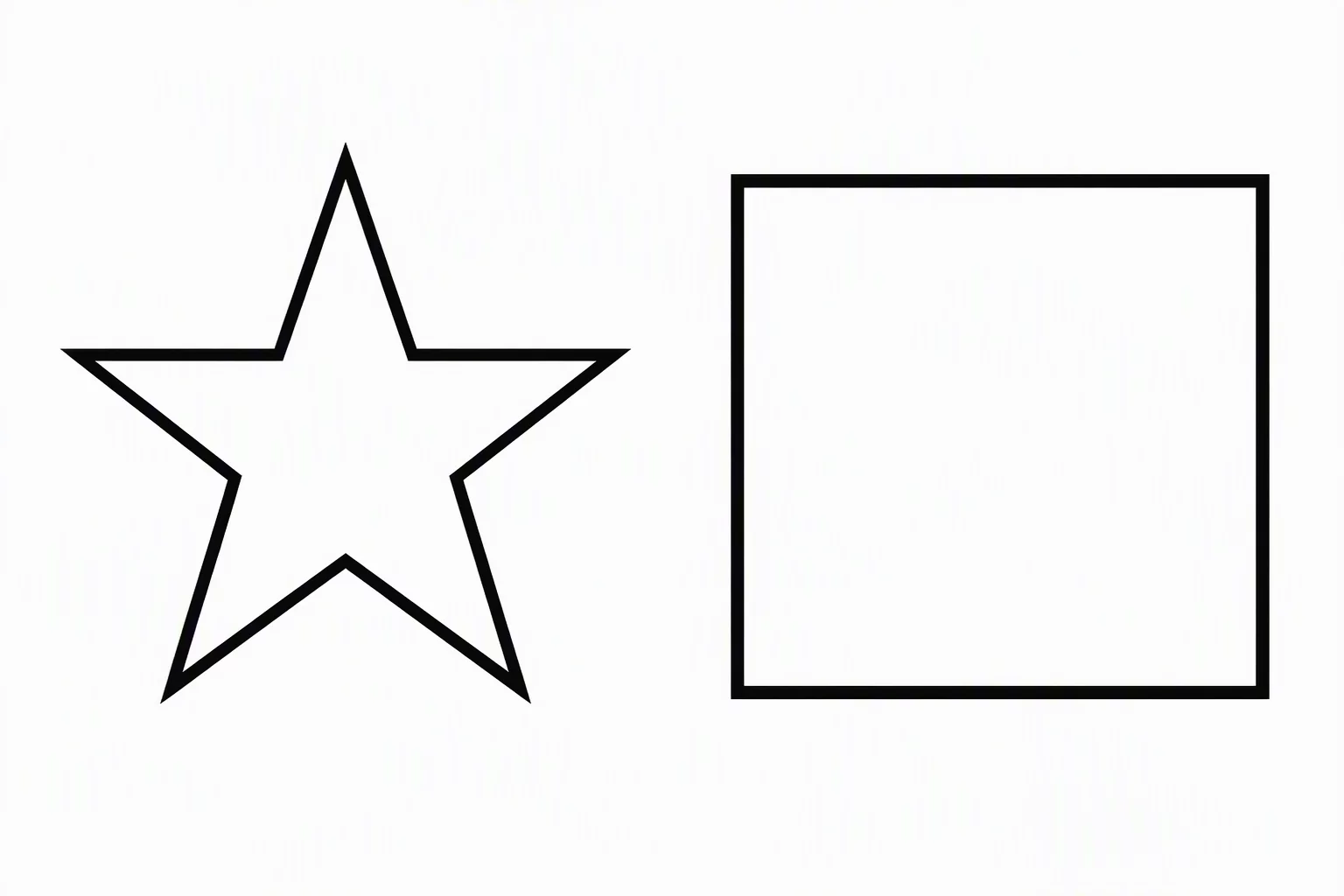
The Mechanical Fallacy of Numerical Line Parity
Assigning an identical 2-point contour across every path in a multi-element vector layout seems like the most logical route to design cohesion. In software palettes, the numbers match perfectly. However, the human visual cortex calculates stroke weight through localized contrast, acute corner density, and total enclosed silhouette area rather than calibrated digital units. A solitary 2-point outline bounding an expansive circular shape appears surprisingly delicate, while the exact same 2-point stroke applied to an intricate, multi-pointed star packs heavy ink into tight angles, making the star look noticeably heavier.
This perceptual disparity becomes especially problematic when technical vector illustrations juxtapose compact iconography alongside broad structural contours. In such compositions, the mitered corners and closely packed lines concentrate visual mass into dark clusters that immediately drag the viewer's gaze away from the intended focal landmark. Relying entirely on fixed numerical values produces unintentional visual hierarchies, leaving complex shapes feeling dense and congested while simpler neighbors appear weak and unfinished.