Stroke Hierarchy • September 8, 2026 • 6 min read

Enhancing Readability Through Weight

How deliberate line thickness variations clarify nested vector paths, anchor focal points, and eliminate perceptual clutter across complex technical graphics.

Stroke Differentiation Silhouette Clarity 3:1 Stepped Scale
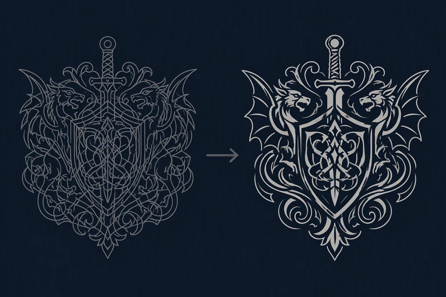
Improving visual recognition of a vector icon through varied stroke thickness

The Perceptual Failure of Flat Line Distribution

When every segment in a vector illustration shares an identical stroke width, the eye receives zero structural guidance. While geometry alone separates inner cuts from external edges in mathematical coordinates, human perception relies on contrast gradations to parse foreground, midground, and internal texture. Uniform lines blur these distinct planes into an undifferentiated wireframe maze that demands conscious squinting rather than delivering immediate visual comprehension.

Assigning a dominant weight to enclosing borders establishes an unmistakable boundary silhouette. Once the boundary is immediately identified, secondary lines can be scaled down by half to trace major articulated joints, while fine tertiary strokes describe subtle surface relief. This deliberate graduation allows the viewer to interpret the holistic shape in milliseconds, preserving legibility across mobile viewports, signage substrates, and rapid interface glancing.

Vector Calibration

Testing Your Stroke Ratios at Scale

Unsure if your artwork outlines will hold up under extreme display downscaling? Review our calibration resources or submit your technical case questions directly.

Ask Our Editors

Strategic Implementation of Stepped Weights

A functional hierarchy operates through distinct categorical tiers rather than arbitrary fractional nudges. In testing vector icons across varying screen resolutions, a 3:1 ratio between the primary perimeter and interior construction lines consistently yields the cleanest optical separation. The perimeter keeps the overall form recognizable even under severe anti-aliasing or distance blur, preventing internal details from bleeding outward.

When every vector path claims equal visual volume, the eye registers nothing but sensory clutter. True readability demands rigorous, deliberate line rationing.

Internal line groups must also observe their own sub-rules. Mechanical joints or structural cuts should occupy an intermediate weight, while surface textures, hatching, and non-structural decorative marks remain on the thinnest tier. Setting up this clear tripartite structure early in vector creation shields graphics from breaking down when converted between small responsive icons and oversized display banners.

Core Methodology

Rules of Line Weight Readability

  • Enforce Clear Perimeter Dominance: Establish the outer contour at two to three times the thickness of internal divisions to lock the subject shape securely.
  • Step Sub-Lines Systematically: Reserve intermediate widths solely for primary subdivisions and reduce surface details to whisper-thin accent weights.
  • Validate Under Quick Glance Tests: Step away from the monitor or squint slightly to confirm that the silhouette remains unmistakable without looking at interior lines.

Readability & Hierarchy Questions