Scaling Cases • September 15, 2026 • 7 Min Read

Downsizing Complex Vector Art

Strategies for minimizing structural loss during reduction. Learn how to recalibrate vector outlines, prevent negative space collapse, and preserve geometric integrity when scaling down intricate compositions.

CorelDRAW Workflow Geometric Hierarchy Optical Proportions
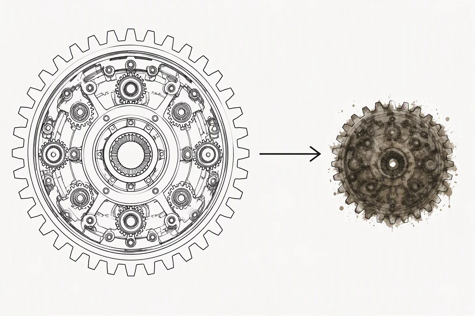
Downsizing complex vector art comparison showing before and after reduction

Why Mathematical Scaling Breaks Intricate Vector Work

Shrinking an elaborate vector illustration seems straightforward when relying entirely on software automation. In CorelDRAW, enabling the Scale With Object toggle ensures outlines adjust in strict mathematical proportion to coordinate changes. However, visual perception operates on physical screen pixels and print dot gain rather than infinite vector math. When an intricate 600 mm emblem with complex internal hatching shrinks down to a 32 mm badge, hairline strokes that looked razor-sharp at full display instantly merge into muddy, unreadable silhouettes.

The core issue stems from negative space clearance. As boundaries compress, gaps between parallel contours vanish far faster than the human eye can resolve individual paths. Outlines that initially framed subtle gradients or interior components begin colliding, completely consuming the inner negative space. Without intentional intervention, the primary subject transforms into a dense block of dark fill where critical anatomical lines lose all contextual definition.

Vector Audit Advisory

Struggling With Scale Deterioration?

Our editorial team explores stroke hierarchy challenges, boundary preservation, and manual simplification methods across complex vector systems.

Submit Inquiry

Calibrating Outer Anchors and Pruning Secondary Paths

Safeguarding structure during significant reduction demands a strict hierarchical audit. Designers must separate the artwork into essential perimeter anchors and decorative interior details. The outermost perimeter must hold its weight to separate the artwork from varying page backgrounds, while internal secondary strokes need progressive reduction or selective elimination. In vector environments like CorelDRAW, grouping elements by semantic hierarchy allows creators to apply differential scaling instead of uniform global transformations.

Pruning tertiary shading lines and consolidating adjacent parallel strokes preserves the primary silhouette with far greater clarity than forcing microscopic hairlines to survive reduction.

Another crucial step involves converting thin overlapping strokes into unified solid geometries where appropriate. When stroke widths drop below 0.25 pt on digital displays, anti-aliasing engines introduce erratic semi-transparent fringes that soften crisp vectors into blurry outlines. Clamping minimum line weights and merging micro-facets creates robust silhouettes that remain unmistakable across favicons, app headers, and compact technical schematics.

Executive Summary

Core Downsizing Principles

  • Establish Boundary Dominance: Keep the outer silhouette distinctly heavier than internal elements to anchor the overall icon structure during scale transitions.
  • Enforce Minimum Stroke Thresholds: Never allow functional strokes to drop below rendering limits where raster displays cause broken or pixelated fragments.
  • Aggressively Prune Micro-Details: Remove tertiary hatching and merge dense internal nodes to prevent negative space between lines from fusing into solid blobs.

Frequently Asked Questions